Whether you need powerful BI reporting to drill down data or modern graphics to view consolidated data, we cover it all with our eQMS software.
In this article, we will focus on the chart capabilities offered in the out-of-the-box software.
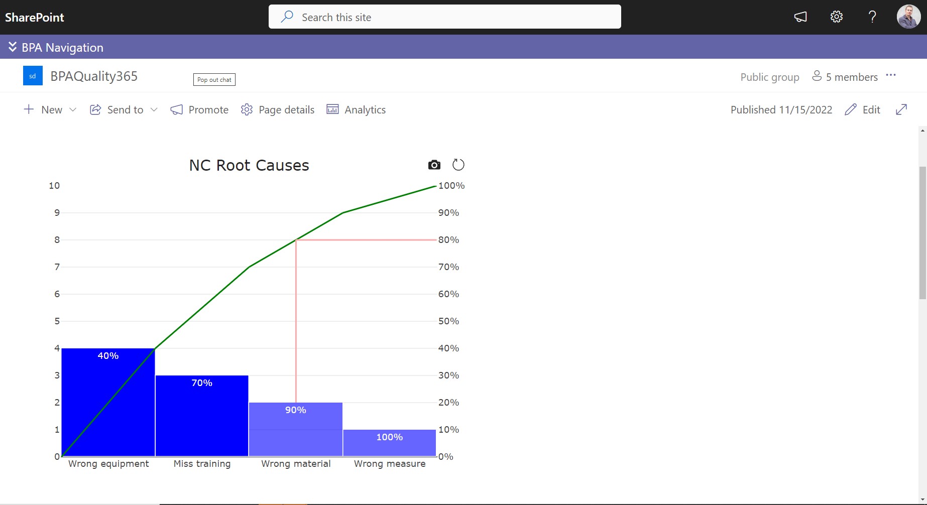
Introducing Pareto Chart to know what root causes are responsible for 80% of the non-conformances.
Because of the Microsoft 365 technology, it’s easy to create interactive Power BI reports for any data in your eQMS software. This type of reporting will be needed for decision makers to analyze data like they want and quickly get the information they are looking for. We propose prebuilt Power BI reports for the different QMS modules. But not everyone has the chance to get covered with a Power BI license.
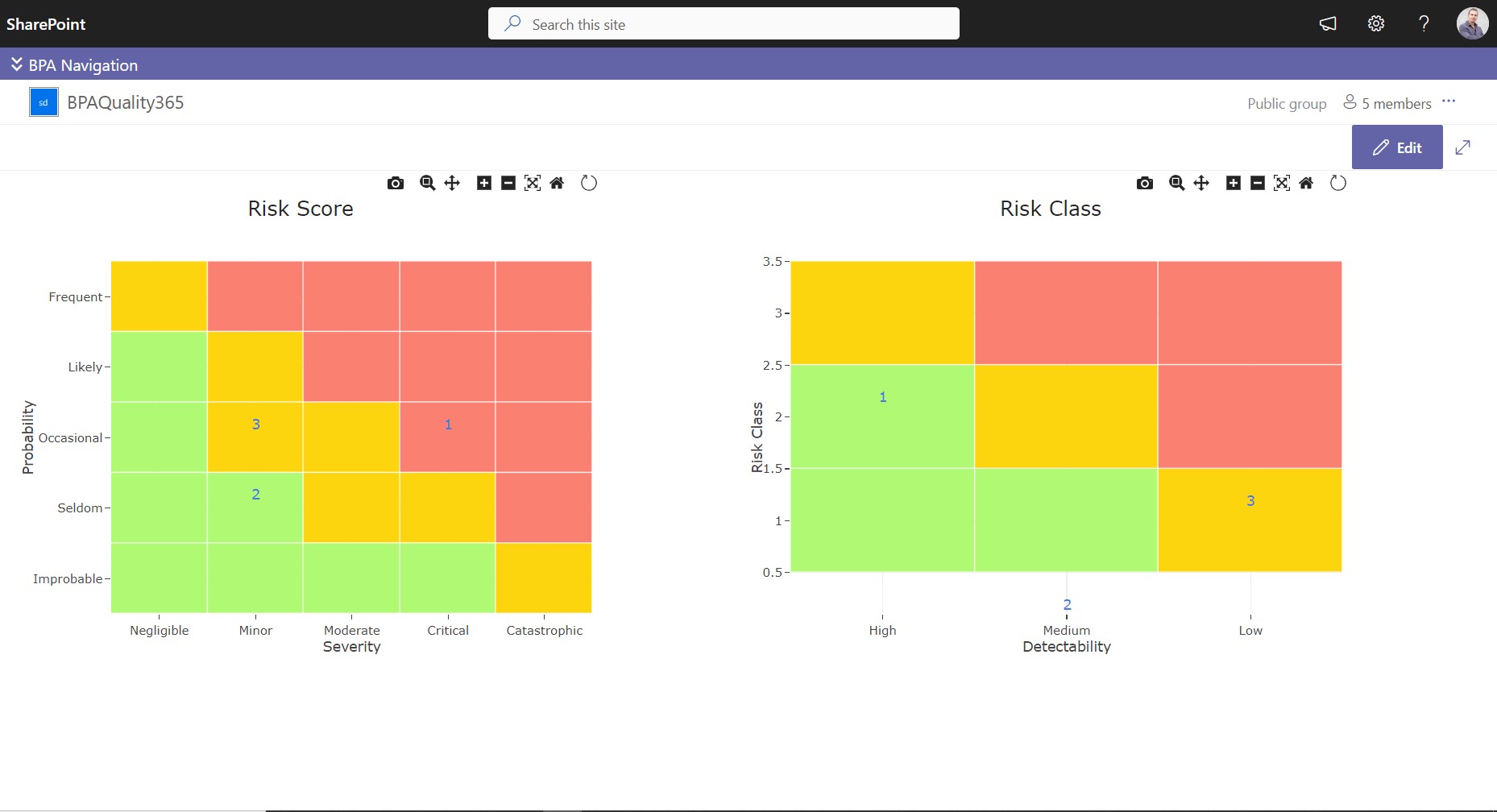
Risk heatmaps best present risk scores in different zones.
For most users, a simplified reporting with graphical charts bring the consolidated data they are interested in, with no need of additional software license needed. We have just introduced great modern charts especially designed for the purpose of quality management, like Pareto charts, risk heatmaps, radars, gauges and more.
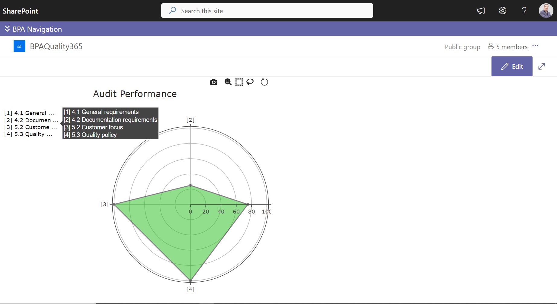
Radars are great to view audit performance per audited regulations.
End users are not always connected to your eQMS software and it’s great to summarize the latest quality events in the home page.
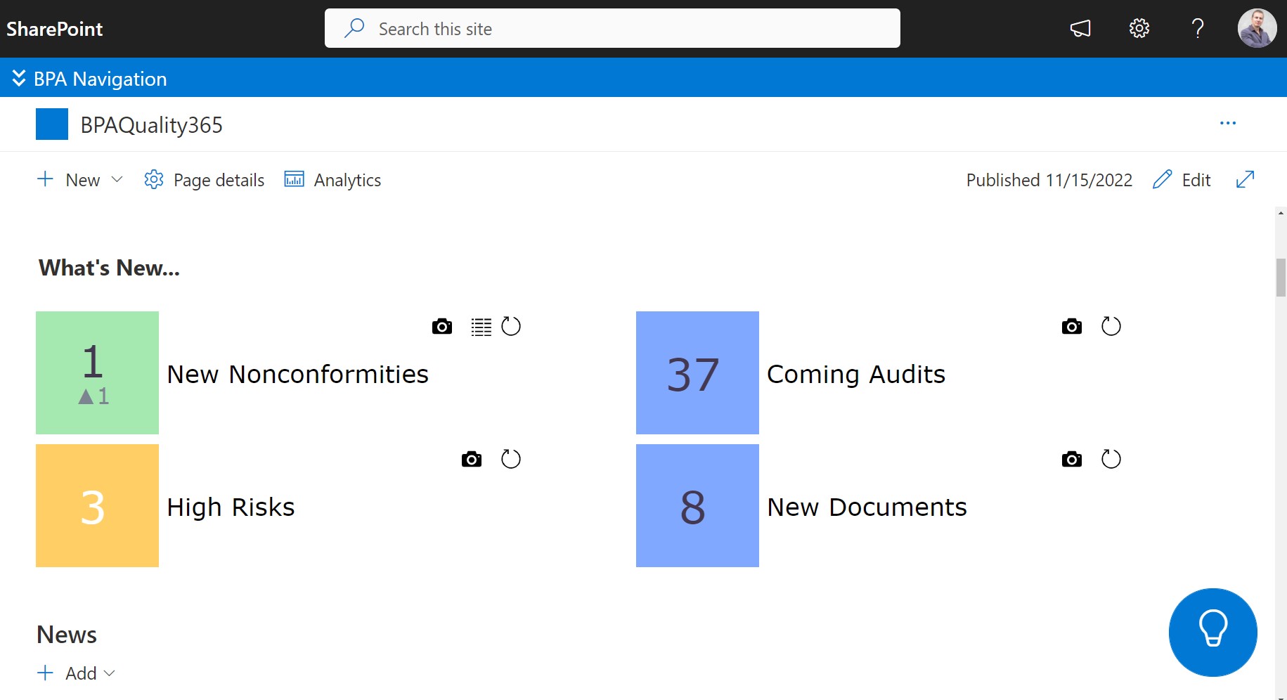
What’s new cards display key indicators for end users.
Other graphics are available to count, sum or average items in gauges or pie charts.
BPA eQMS software brings easy reporting for everyone, especially if Power BI is not an option.
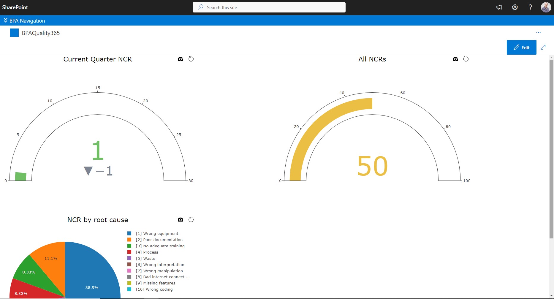
Example of a non-conformance dashboard.